Progress bar
Color
| Element | Property | Color token |
|---|---|---|
| Label | Text color | $text-primary |
| Helper text | Text color | $text-helper |
| Track | Background | $border-subtle |
| Bar: active | Background | $border-interactive |
| Bar: success | Background | $support-success |
| Icon: success | Fill | $support-success |
| Bar: error | Background | $support-error |
| Icon: error | Fill | $support-error |
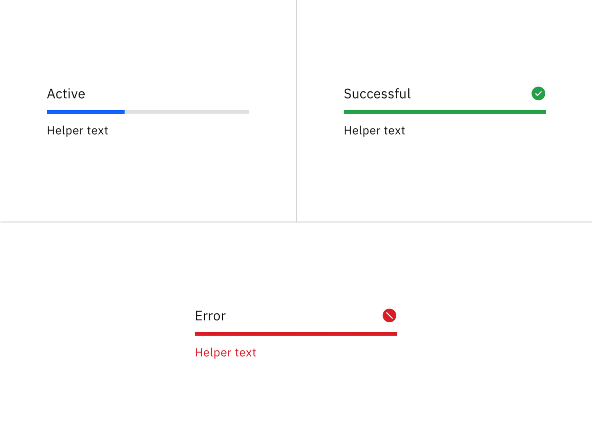
Status colors
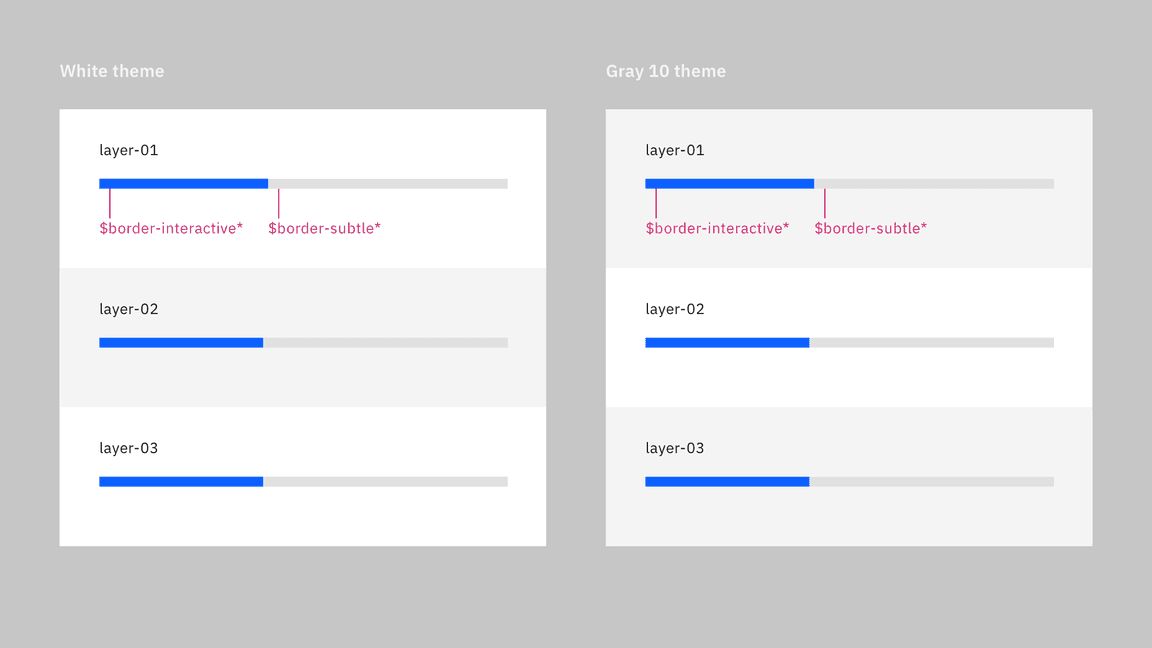
Progress bar colors for light themes
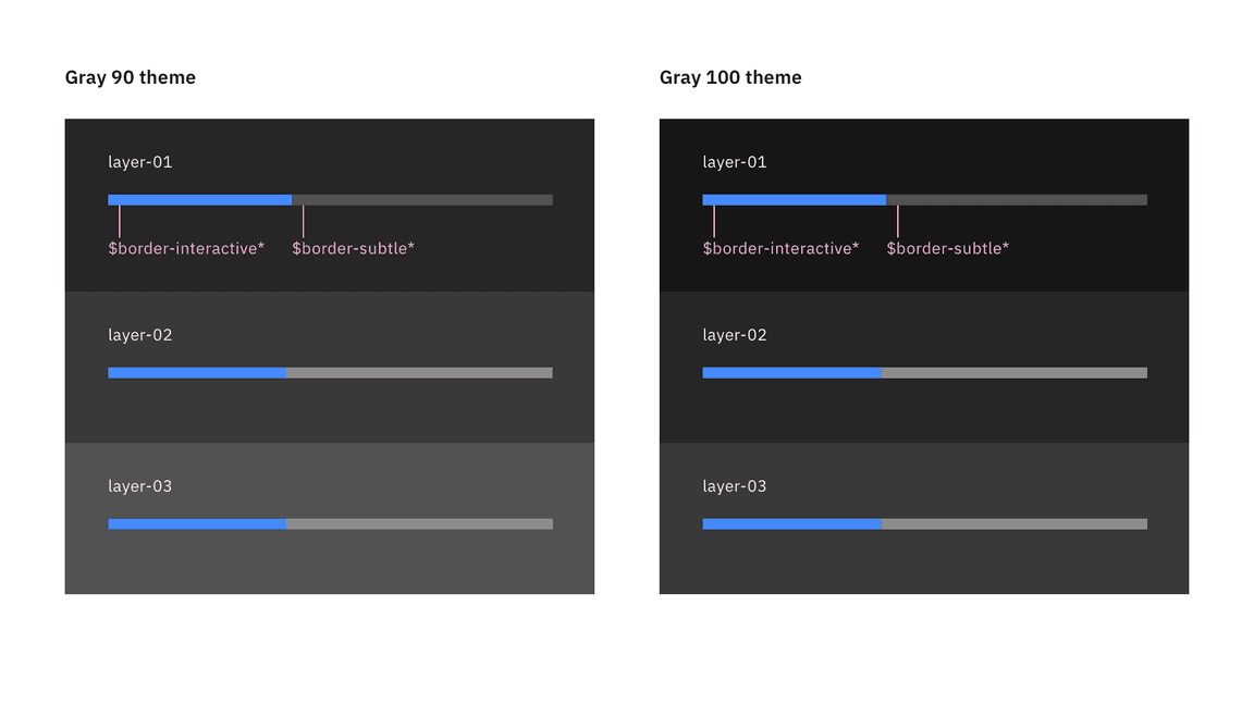
Progress bar colors for dark themes
Typography
The width and height of a popover container can vary depending on the amount of content within it. We recommend to not exceed a popover width size of four columns.
| Element | Font-size (px/rem) | Font-weight | Type token |
|---|---|---|---|
| Label | 14px / 0.875rem | Regular/400 | $label-01 |
| Helper text | 12px / 0.75rem | Regular/400 | $helper-text-01 |
Structure
Progress bar can have two ways for text alignment. The first one has text aligned left with progress bar and the second one has text aligned to the middle of the progress bar. The width of a progress bar can be customized appropriately for its context. The minimum width of a progress bar is 48px and keep its width to a maximum of six columns when possible.
| Element | Property | px / rem | Spacing token |
|---|---|---|---|
| Label (top aligned) | Padding-bottom | 8/.5 | $spacing-03 |
| Helper text | Padding-top | 8/0.5 | $spacing-03 |
| Label (left aligned) | Padding-right | 16/1 | $spacing-05 |
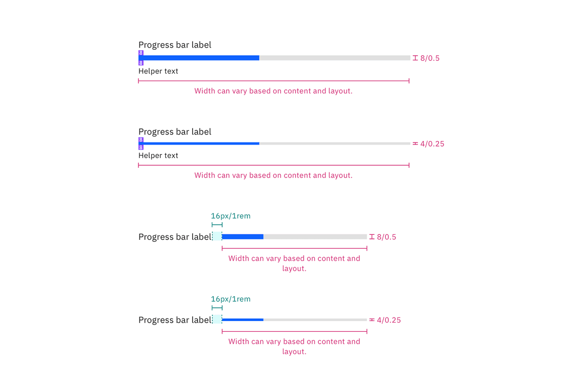
Structure and spacing measurements a popover container. | px / rem
Sizes
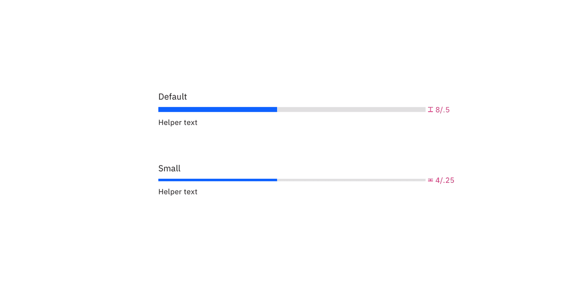
There are two sizes for the progress bar height, default and small.
| Size | Height px / rem |
|---|---|
| Default | 8 / 0.5 |
| Small | 4 / 0.25 |
Structure and spacing measurements between a popover container and trigger button. | px / rem